.png)

Context: HCDE 308 Final Project (Visual Communication)
Duration: 5 weeks (Winter 2019)
Collaboration: Mostly individual, except for brand research (in group of 4)
Skills Demonstrated: Blending of typography, colors, and visual treatment to create a design system
Tools Used: Adobe Illustrator
For my five-week final project for my visual design course I was tasked with creating a brand book for a local nonprofit. I began by analyzing where my client's online presence and design choices did or did not match with their goals and mission statement.
Once I had a clearer goal about my client's values and mission, I created logos, icons, a task flow diagram, wireframes, hi-fidelity mockups and a brand book that tied my visual system together.
My client throughout this project was Fare Start, a nonprofit organization in Seattle that provides culinary opportunities to individuals struggling with addiction, homelessness, and poverty.
To begin my project, I conducted brand identity research to better understand what values my design system needed to convey.
To present our findings, we were organized into groups of four. Our presentation first outlines their mission statement, what Fare Start does, their audience, their goals, and how well their online presence matches with their mission.
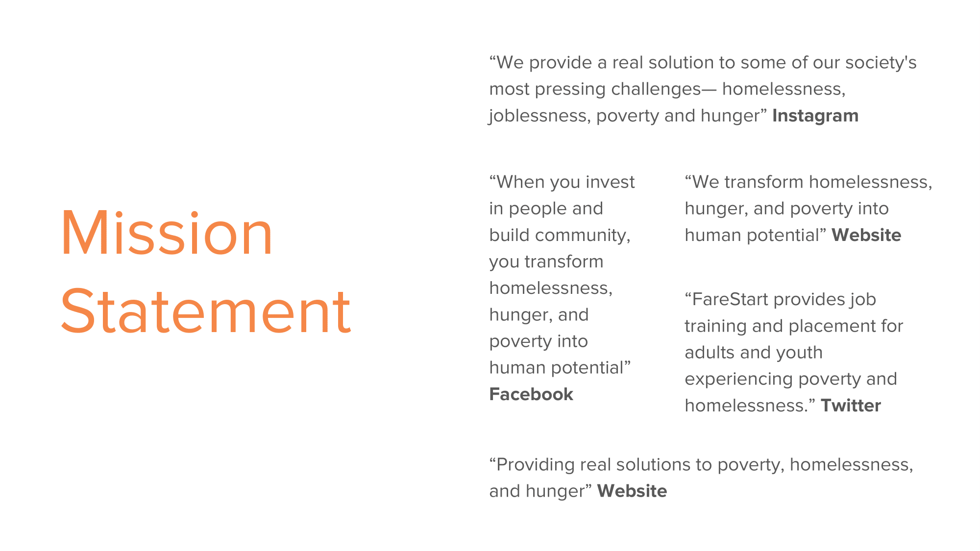


Brand Identity Presentation made in a group of 4. I designed slides 1-6 (Introduction), 12-14 (Mission Statement and Engagement Analysis), and 18-19 (Design Opportunities).
I wanted to evoke a feeling of opportunity and community in my logo to convey Fare Start's mission: transforming homelessness, hunger, and poverty into human potential. I began with thumbnail sketches.

A snippet of thumbnail sketches of my first ideas for a Fare Start logo. Click to enlarge.
After class critique, I took my favorite ideas to Illustrator for another round of critique. In my final logo design, I utilized similarity and symmetry in the human pictorials to create a sense of community and a common goal by them both holding up the same plate. The increased weight on the word START in Fare Start emphasizes the opportunity for a new start and unlocking human potential.

The final logo I created after a couple rounds of ideation.
I realized through my research that Fare Start's sophistication and culinary artistry were not conveyed through their current brand identity, so these were the two directions I focused on for my icons. I again started with thumbnail sketches and translated my favorites into Illustrator.

A snippet of thumbnail sketches of my first ideas for various Fare Start icons. Click to enlarge.
I wanted to evoke a sense of artistry in my final icons. To accomplish this, I utilized the Gestalt principle of closure and took a more abstract approach to my pen tool drawings. The tapering and wispy ends that do not fully complete the picture give the icon a sense of artistry.


The final set of icons resulting from revisions throughout the project.
The next step in forming the brand was redesigned mobile screens, but to make improvements in the UX of those screens I had to know where pain points currently existed. I visited the current website and made a user taskflow diagram to illustrate the steps to make a reservation and the pain points that currently existed.

A user task flow diagram that shows current pain points in making a reservation on the current website. Click to enlarge.
I tried to eliminate the pain points I found in my task flow diagram, and wireframed how my mobile screens might look. I tried to make all Fare Start’s restaurants and cafes clear and organized, with each one having a defined “make a reservation” button.

Wireframes I sketched that helped inform my hi-fidelity mockups. Click to enlarge.
The next step was translating my wireframes into hi-fidelity mockups. This was the beginning of the color, typography, and visual treatment part of my design system.
I paired Avenir with Minion Pro to create a modern but sophisticated feel, and my primary color was orange to convey warmth and hope. I used a 20% orange overlay on each of the images to continue the visual system.
Three hi-fidelity screens that demonstrated my visual system, logo, and icons. Click to enlarge.
My logo, icons, and mobile screens all created a visual design system that gives Fare Start a modern yet sophisticated feel. Fare Start’s culinary artistry is represented through the abstract treatment on the icons and the artistic pictures of their food on the mobile screens. Their warmth and encouragement are represented through the logo and the use of orange throughout. To showcase my design system, I created a brand book.


Final brand book that presented my Fare Start brand redesign.
This was the first project that relied solely on my visual design skills, and I am proud of what I put forth. This project grew my visual design skills tremendously. I found all these deliverables to be very enjoyable, but my favorite is my icons. Beyond becoming a self-prescribed pen tool master, I discovered a love for typography and the power it has in a visual system. I still see room for growth, but this was a great starting point in my visual design journey.
.png)